Creating Ourselves
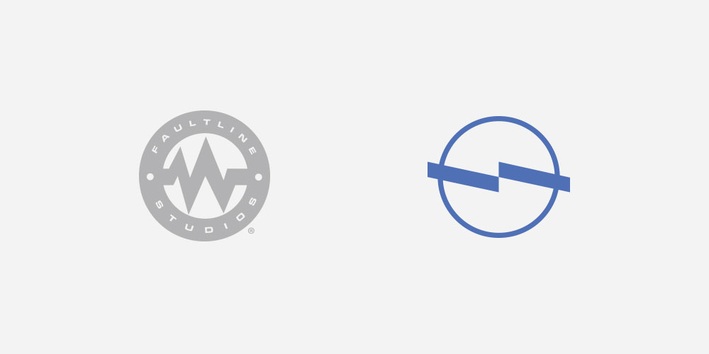
In 2014, our own brand was in need of a renovation; we didn’t quite associate with the brand components that we had at the time.
We aimed to distill everything that we liked about companies like ours and combine it with the type of company that we wanted to be. Design decisions were based on what felt right as opposed to what was expected or what looked the most correct. We focused on honesty and dependability as Faultline’s core ideals and discovered ways to design with them in mind.


Simple and Clean
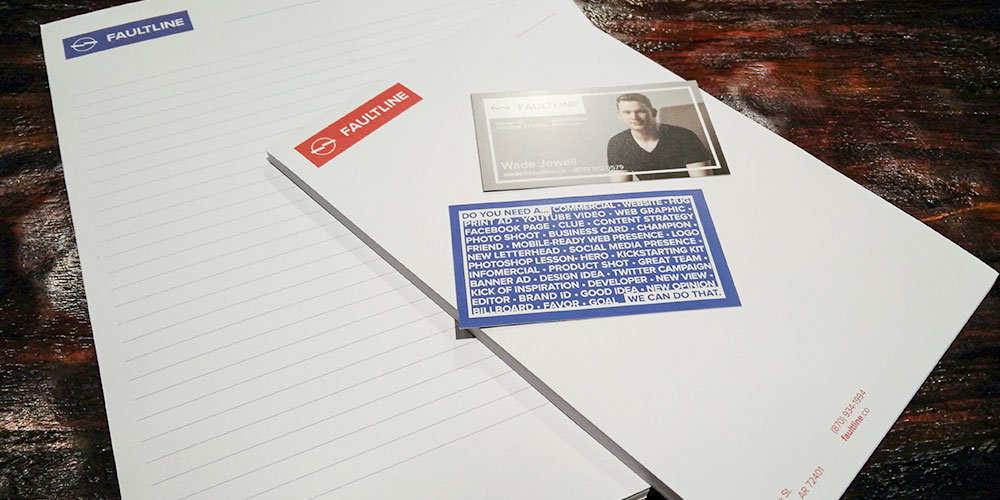
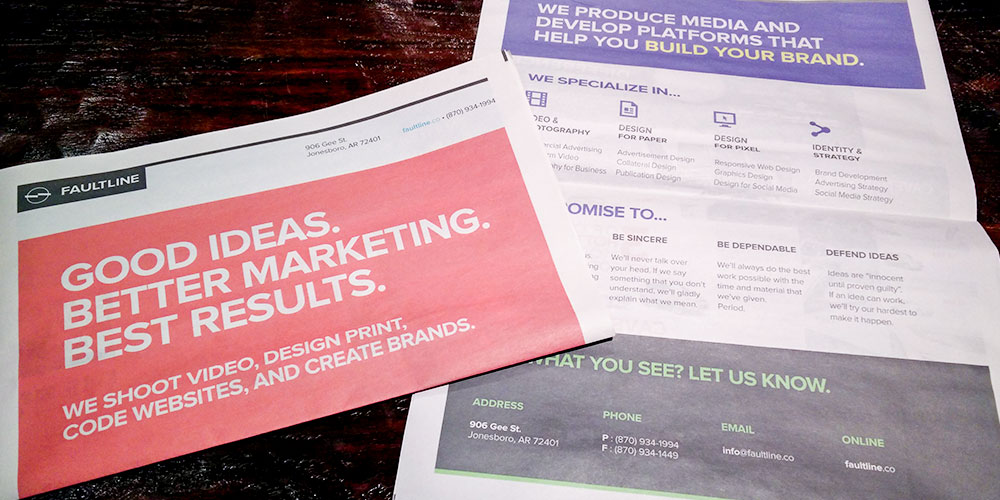
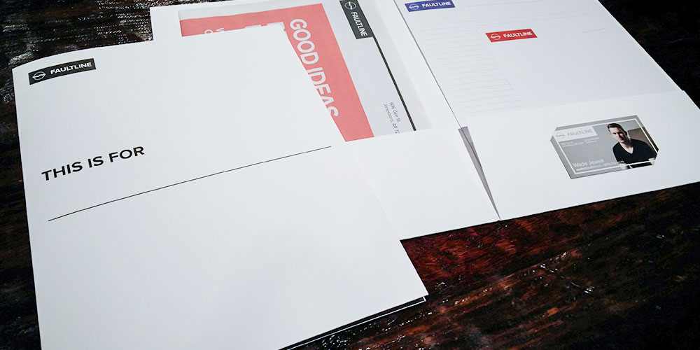
After the initial Faultline icon was designed, most of the other elements fell into place. Together, it’s sharp, purposeful, and ultimately tasteful. We use such simple — almost minimal — documents so the information on them will be more apparent.

